One focal object
Every scene or route has a clear visual lead. Supporting information stays subordinate.


Prospr brand and product system
The public site tells the story. Dashboard home frames the decision. Trade compresses the workspace. They share one material system without pretending every surface should have the same composition.
Non-negotiables
Every scene or route has a clear visual lead. Supporting information stays subordinate.
Use it for the next consequential action, active navigation, focus, or the narrative thread.
Green, red, blue, and warning tones communicate state. They are not decorative atmosphere.
Prototype, simulated, planned, and live states remain explicit in copy and product chrome.
System model
Consistency comes from shared materials and behavior, not from forcing editorial pages and professional workspaces into the same template.
Low density · scroll-led
Large editorial statements, cinematic product theatres, alternating dark and warm chapters, and a single orange path that carries the narrative forward.
Medium density · stage-led
A persistent shell, one dominant portfolio stage, clear status and time context, then quiet supporting cards for positions, strategies, and performance.
High density · operator-led
Stable panel geometry, compact controls, tabular price data, and conventional buy/sell semantics. Density is functional, never ornamental.
Foundation
Use canonical vector assets. The mark remains Electric Blue on black, white, or pearl. Product depth comes from neutral Midnight steps, not blue-cast panels or glow.



ProsprMark.svg + ProsprWordmark.svg are the application default. Do not live-type the wordmark.
Quotation / tagline
Institutional intelligence. Built for everyone.
Syne Semi Bold, upper and lowercase, one sung line. Never a title, paragraph, or UI.
Interface
Portfolio value
Available cash
Active strategies
Plus Jakarta Sans for navigation, controls, labels, and readable product copy.
Data
$130,444.01
+0.49%BTC/USD · SIM · 11:18:47
Plus Jakarta Sans with tabular numerals. The data role is not a second typeface.
Public / Storytelling
The landing is allowed to breathe. Product proof remains concrete, but it is staged inside a scroll-led narrative instead of a dashboard shell.
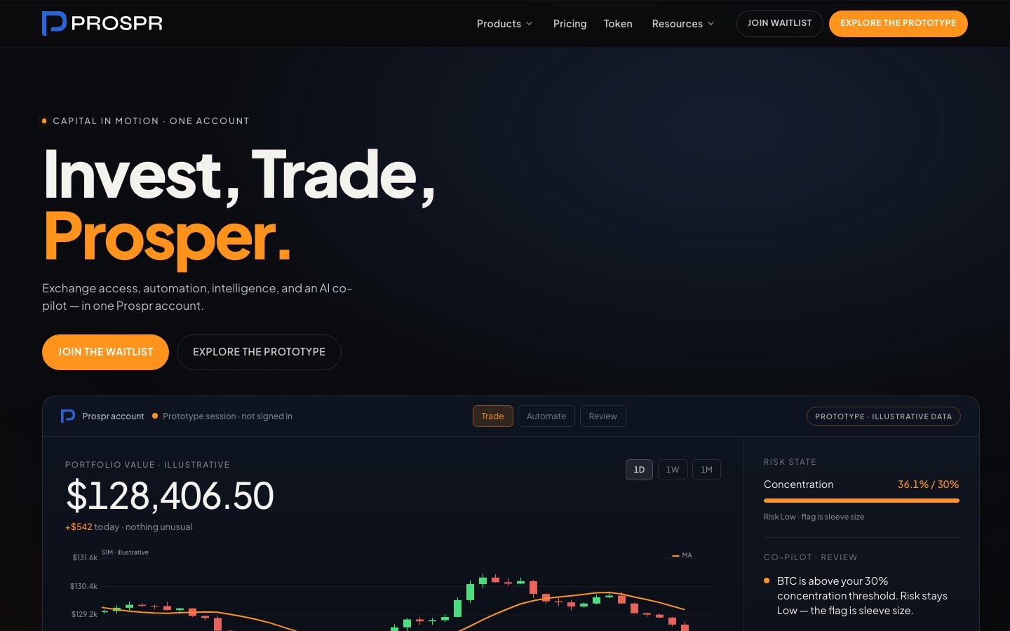
The public surface may use large type, broad negative space, and scene transitions. Those are storytelling tools, not application defaults.
Dashboard / Decision
Dashboard home is the composition baseline for high-traffic application pages: persistent shell, one dominant stage, then quieter working surfaces.
.app-page for route containment and shared responsive gutters..app-stage + .app-chrome for the single focal lead.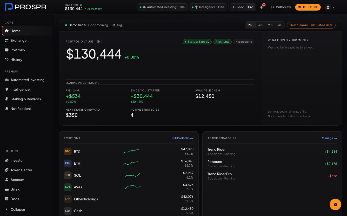
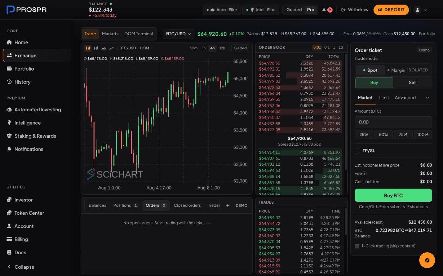
Trade / Execution
Trade is not a home-style theatre. It is a stable operator workspace that inherits the same materials, type, focus, and semantic color rules.
Component grammar
Use semantic roles rather than visual one-offs. Buttons show action reversibility; badges show state; stages establish hierarchy; charts use a controlled series order.
Action hierarchy
State badges
Mode / horizon
| Asset | Price | 24h |
|---|---|---|
| BTC / USD | $65,068.64 | +0.50% |
| ETH / USD | $3,524.09 | -0.18% |
Portfolio value
$130,444.01
+0.49% · last 24 hours
What moved
.app-btn*, .app-badge*, .app-banner, and shared chart roles.Composition recipes
The React composition layer makes Home, route families, and Exchange repeatable without forcing every workflow into the same density. New routes choose one family, then use shared headers, sections, grids, toolbars, cards, and semantic controls.
One page title, optional actions, then clear sections. Use for Intelligence, utilities, documentation, and secondary portfolio views.
DashboardPage
DashboardPageHeader
DashboardSection + DashboardGrid
Page identity leads; route navigation gets its own scan line; metadata and local controls stay attached to the title. Use for Portfolio, Automated Investing, Intelligence, Earn/Rewards, Token Center, and Account/Settings.
DashboardWorkspaceHeader
DashboardWorkspaceNav
shared selector + mobile scroll
Compact context, stable toolbar, and information-dense panels. Use for Exchange, order management, DOM, and Pro consoles.
DashboardPage variant="workspace"
DashboardPageHeader compact
DashboardToolbar
One focal metric or decision with condition-setting chrome and an optional supporting rail. Never repeat multiple stages on one page.
DashboardStage
DashboardChromeGroup
main + optional rail
A bounded column for progressive disclosure, onboarding, and account readiness without borrowing public-site scale.
DashboardPage variant="flow"
DashboardPageHeader
DashboardSection
One task group per section, comparable values in stable rows, and explicit status or consequence. Use for Account, Billing, Security, Documents, Tax, Investor, and Token Center.
SettingsSection + SettingsRows
SettingsRow + SettingsNotice
SettingsSwitch + app-control
Implementation sources: src/components/dashboard/ui/DashboardComposition.js and src/components/settings/SettingsComposition.js. Layout contract: src/app/global.css. Copy-ready JSX and behavioral rules: DESIGN-SYSTEM.md §6.4.
Change record
This is the design migration completed after the July brand refresh. It records the intentional changes so the previous visual language is not reintroduced route by route.
| Previous treatment | Current treatment | Reason |
|---|---|---|
| Blue-cast crypto dashboard | Neutral Midnight surface ramp | Aligns product material with the public system and improves data legibility. |
| Glow buttons and luminous cards | Semantic controls and tonal depth | Consequence is communicated by role, not visual noise. |
| Brand-gradient route heroes | One neutral stage on selected leads | Creates composition hierarchy without turning tools into marketing panels. |
| Independent route gutters | .app-page containment | Keeps shell rhythm and responsive padding consistent across active routes. |
| Detached route pills and duplicate title rows | Workspace header + shared selector navigation | Keeps location, context, state, and controls in one responsive hierarchy while matching Documentation and Exchange. |
| Gradient utility headings, glow states, and one-card-per-setting layouts | Shared utility sections, rows, notices, fields, and switches | Makes account controls easier to scan and gives every utility page the same reproducible task hierarchy. |
| Raw Tailwind palette colors | --app-*, --ink-*, --data-* | Color now communicates a stable semantic contract. |
| Per-page chart palettes | chartTheme + chartSeries | Comparable data uses a predictable visual order. |
| Orange or brand color as decoration | Orange for commitment and selection | Primary actions remain immediately identifiable. |
| Generic app treatment for Exchange | Dense terminal exception | Professional execution requires stable columns and conventional buy/sell semantics. |
Certified scope: 50 active user-facing /dashboard page components and all nine active /settings pages. The 18-page Utilities scope covers Investor, seven Token Center routes, Account/Settings, Billing, and Documentation. Six executable recipes define standard, route-family, dense workspace, stage, flow, and utility composition. Admin surfaces remain outside this certification.
Source map
Live implementation wins when copied values drift: landing material lives in src/components/public/landing/styles/foundation.css; application tokens and primitives live in src/app/global.css; chart roles live in src/components/chart/theme.js.